Marks, Video,
and Print Design
Brand
Art Direction
Motion and Video
First Resonance
During my time at First Resonance, I took on some projects outside of leading the redesign of ION. Most of my work outside of the product design activities was completed during my commute three days a week. Some of my favorites are shown here.
This was a significant undertaking. I directed, shot, edited, audio-engineered, and finalized this 2024 roadmap around Thanksgiving. I finalized almost everything in After Effects.
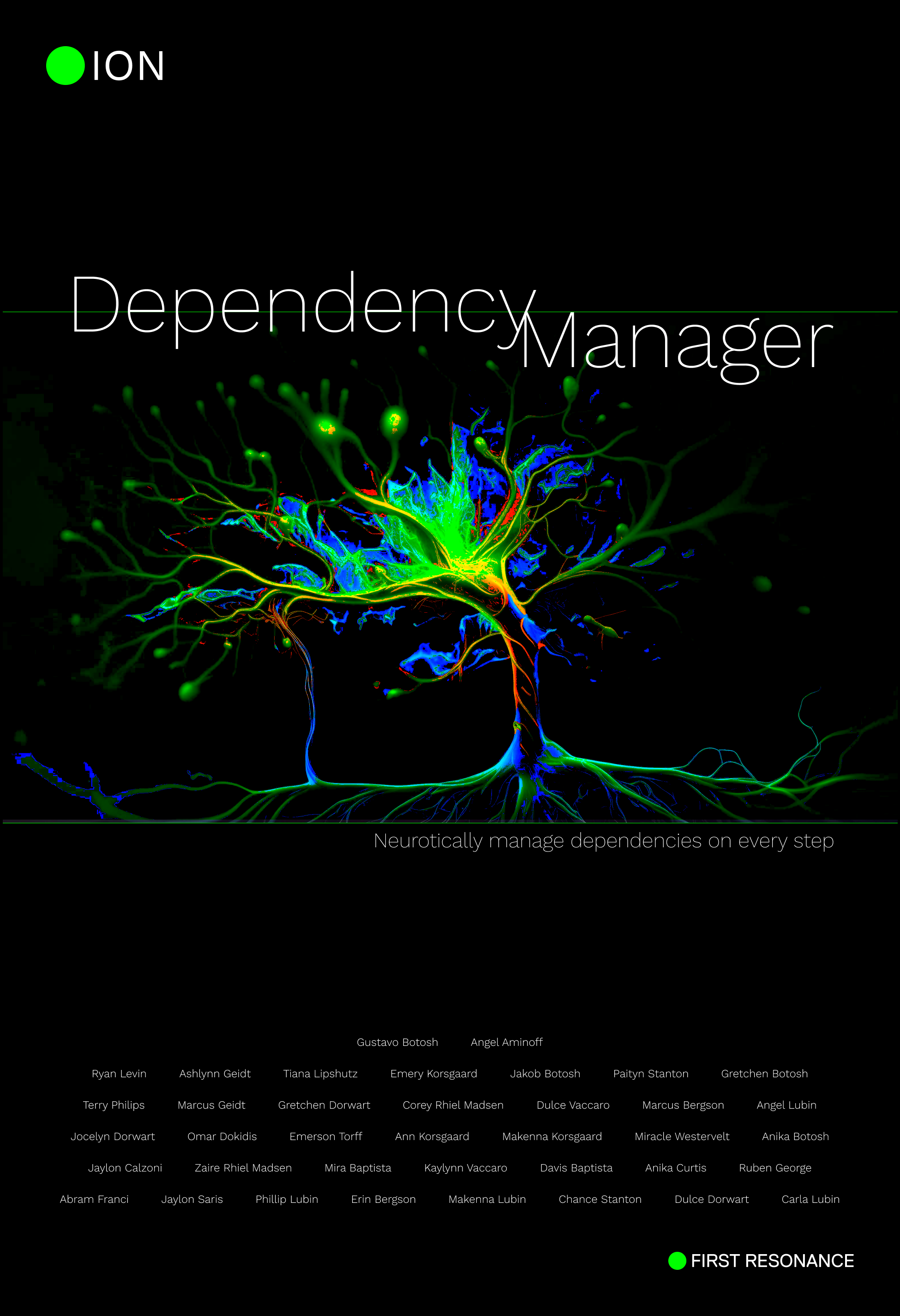
While commuting on the train to and from DTLA, I designed posters for the office. This poster was for an extensive feature that displayed not only dependencies in a set of work instructions and gave the user important information per work instruction step at a glance.
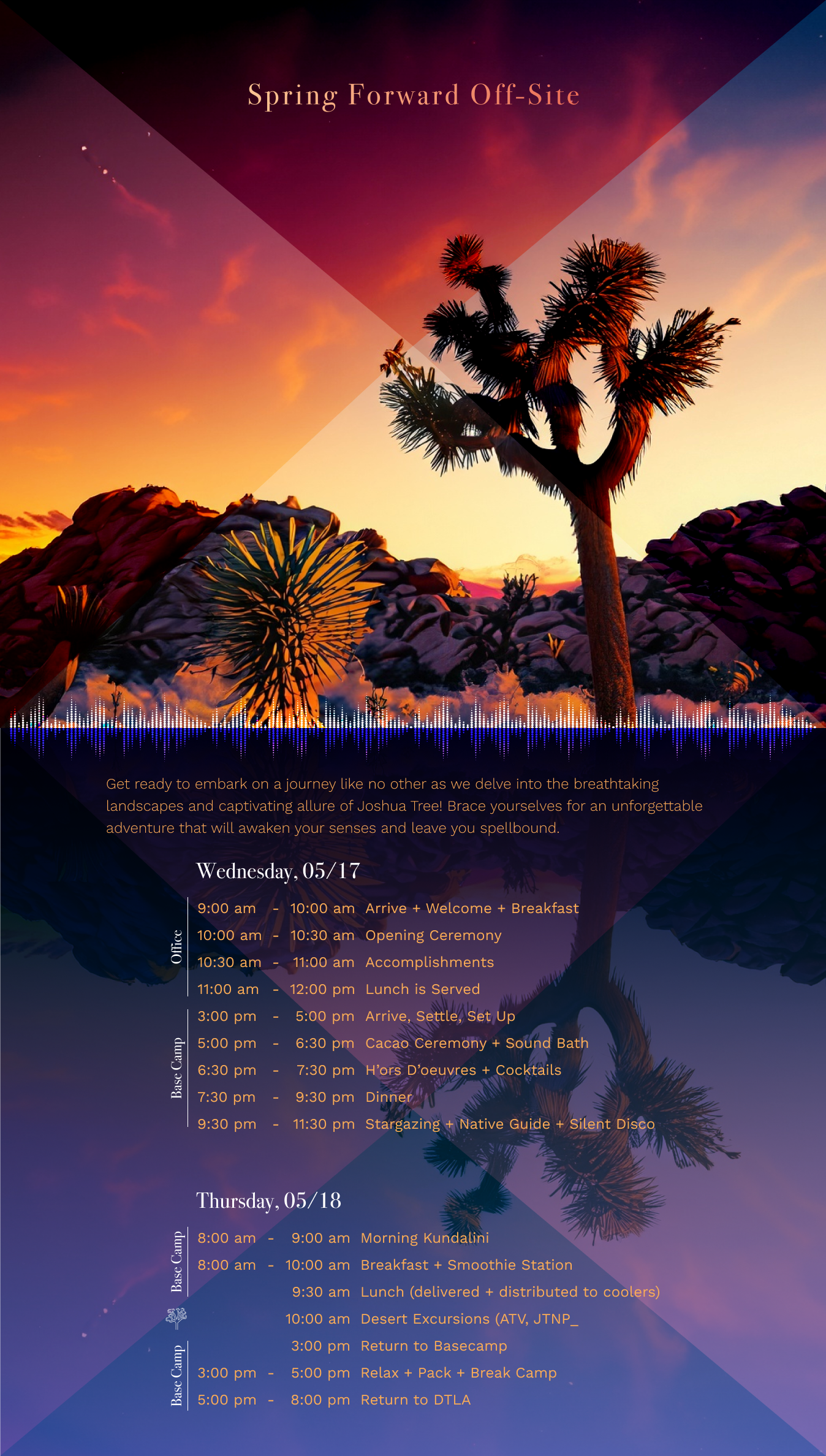
Offsite flyers are a must-have when aligning a team in the desert.
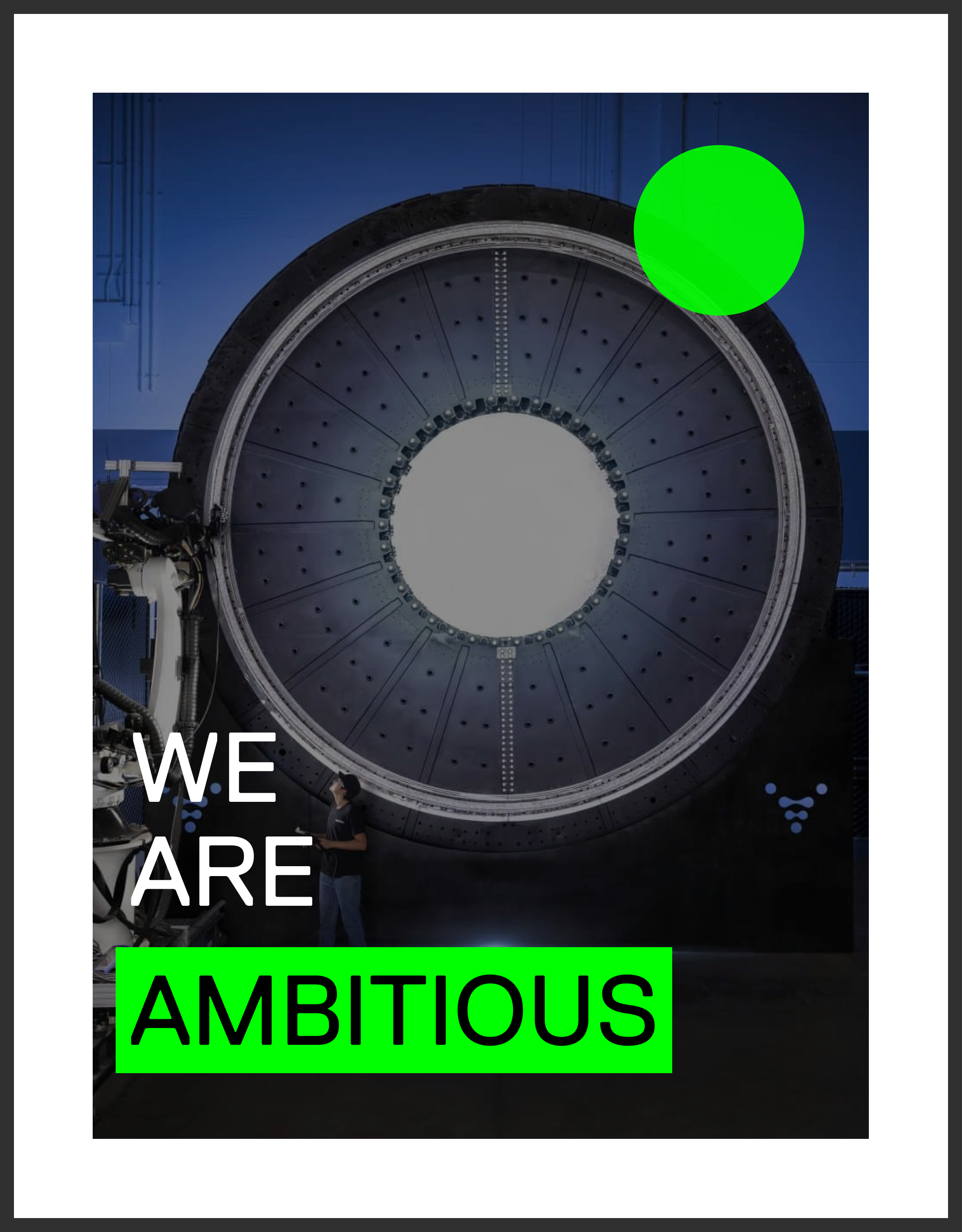
One of eight core value posters. This one features Relativity Space's "Star Gate" 3d printer.
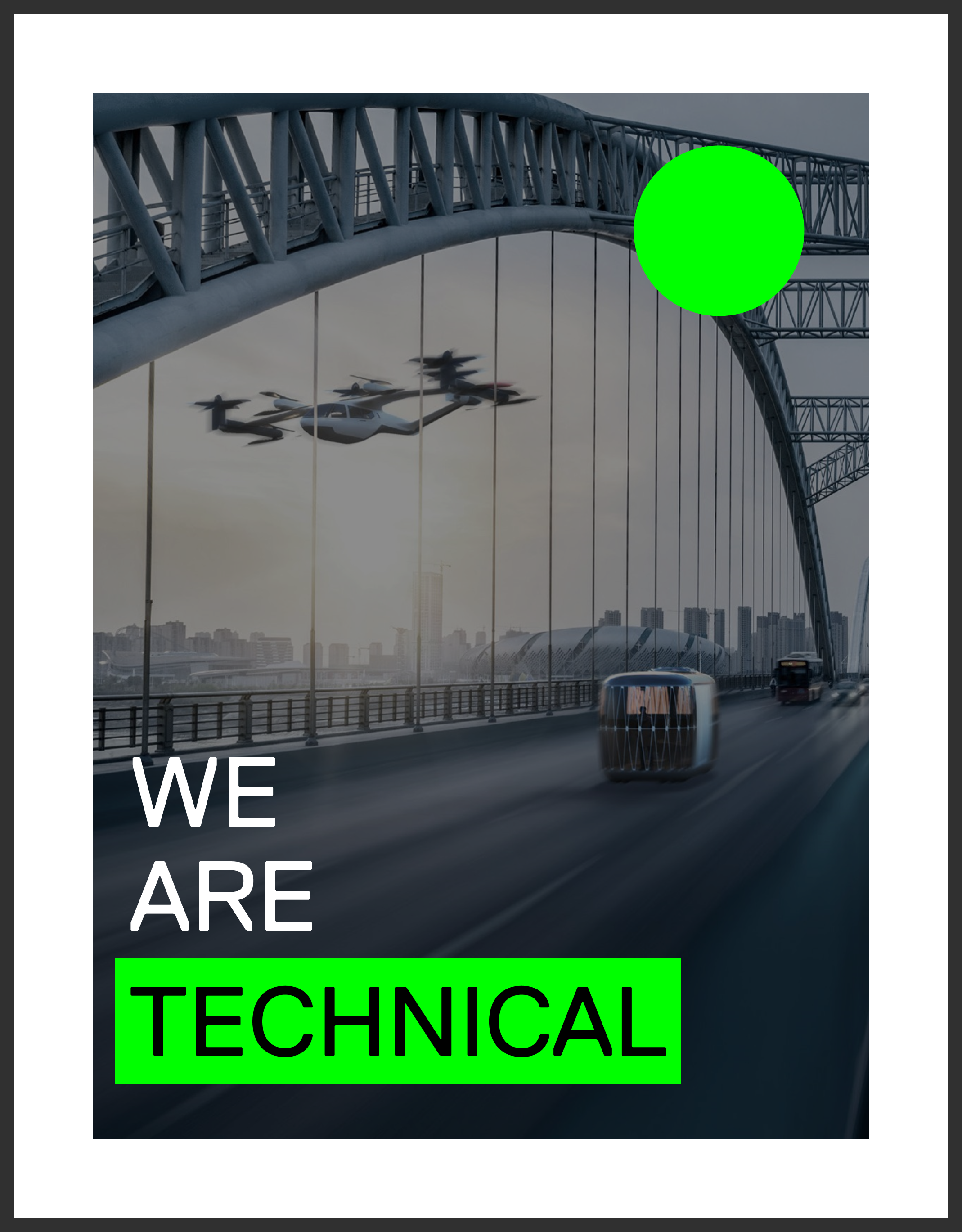
Another one of eight core value posters. This one features an early render of Joby's eVTOL.

Some digital sketches for the initial redesign of Backe.
Backe ReBrand
A sketch of a 3d-esque and slightly rotated “B” was placed on my desk. John Backe, our fearless CEO who crafted said sketch, wanted this and our current brand colors to be the foundation of our next mark. Inspiration was also drawn from the interior decorations of the office, which is ripe with examples of retro industrial design, and discussions about Backe with the CEO and EVP.
The first concepts played on the concept of depth, light, shadow, and the 3d plane. Most of the digital sketches were designed around the idea of creating a multitude of positive and negative spaces between the varying shapes and semi-transparent colors.
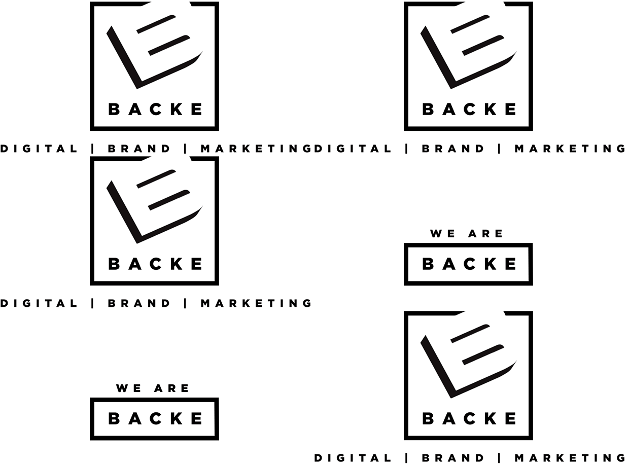
The dimensionality of the final ‘B’ was simplified by using the negative space between the ‘B’ and the 3d reflection. This flat black 3d reflection and simplicity in form prevents the viewer from experiencing the optical illusion of protrusion/depression that occurred when viewing some of the earlier marks (not shown). The black box is used to frame the ‘B’ and ‘Backe’ creating an lockup that hints at a sing with protruding ‘B’. Finally, the “digital brand marketing” (DBM) lockup creates a 2d horizon line for the mark to sit upon. Keeping the DBM lockup outside of the frame allows for it’s usage to be optional.

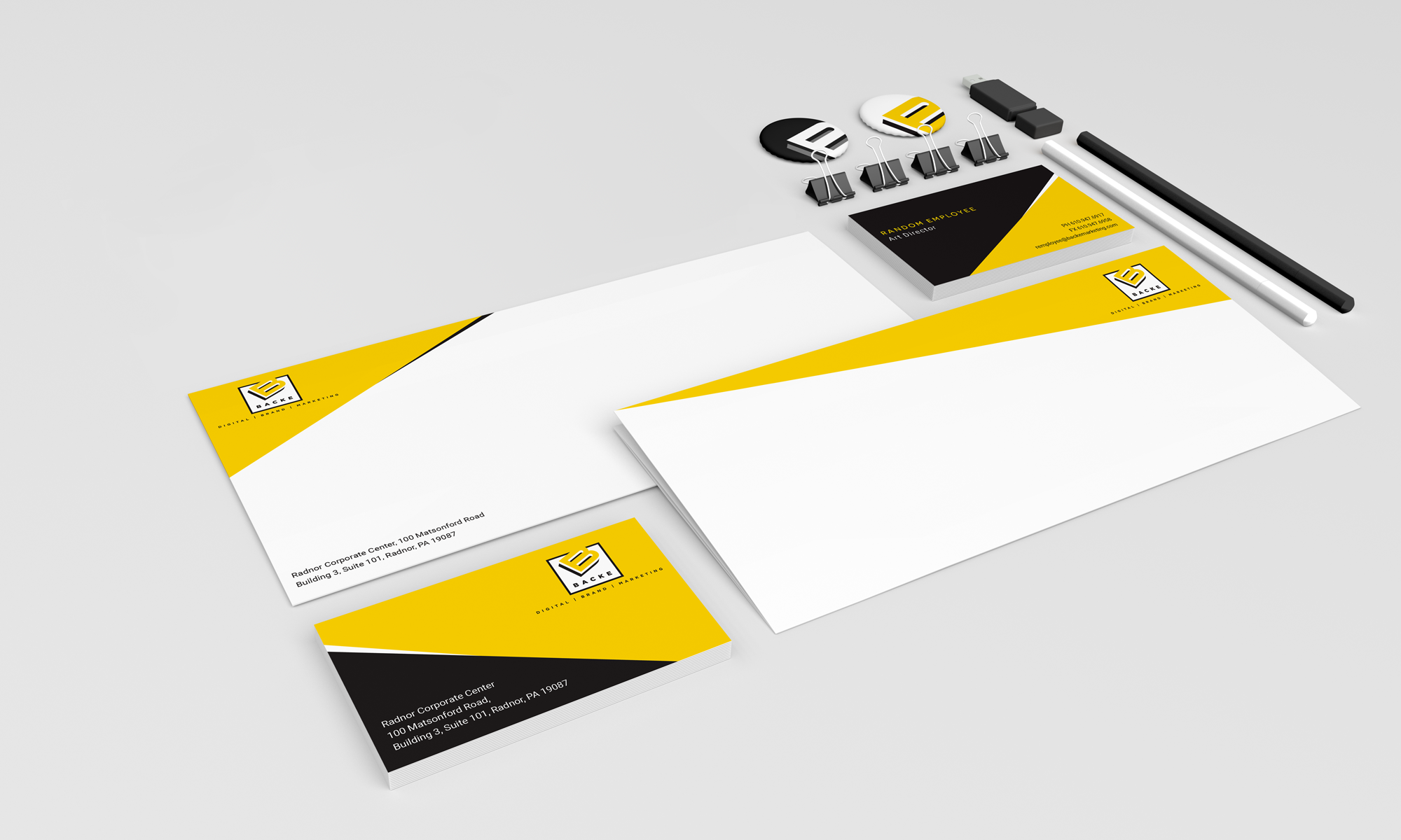
Something is exciting about writing a brand book. This directly correlates with my love for well written documentation.
Jacobs
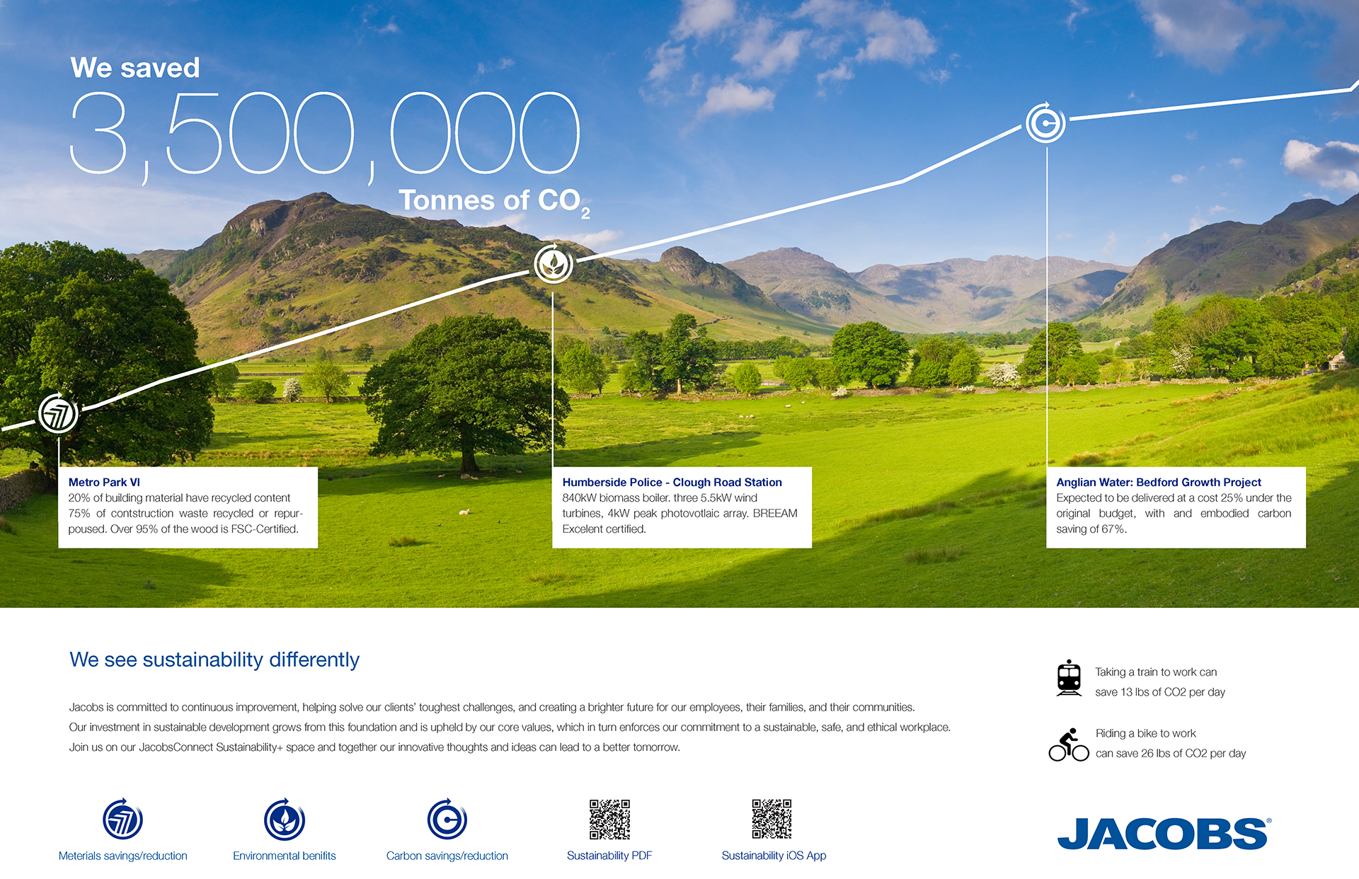
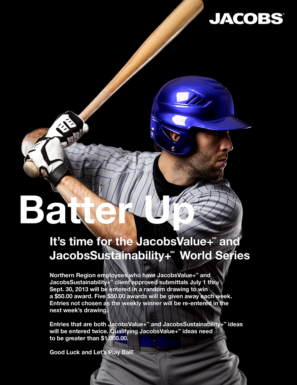
During my time at Jacobs, I helped with an international sustainability campaign. These posters were fully editable in PowerPoint so the local offices could customize them with their contributions.
Blackout Soutions
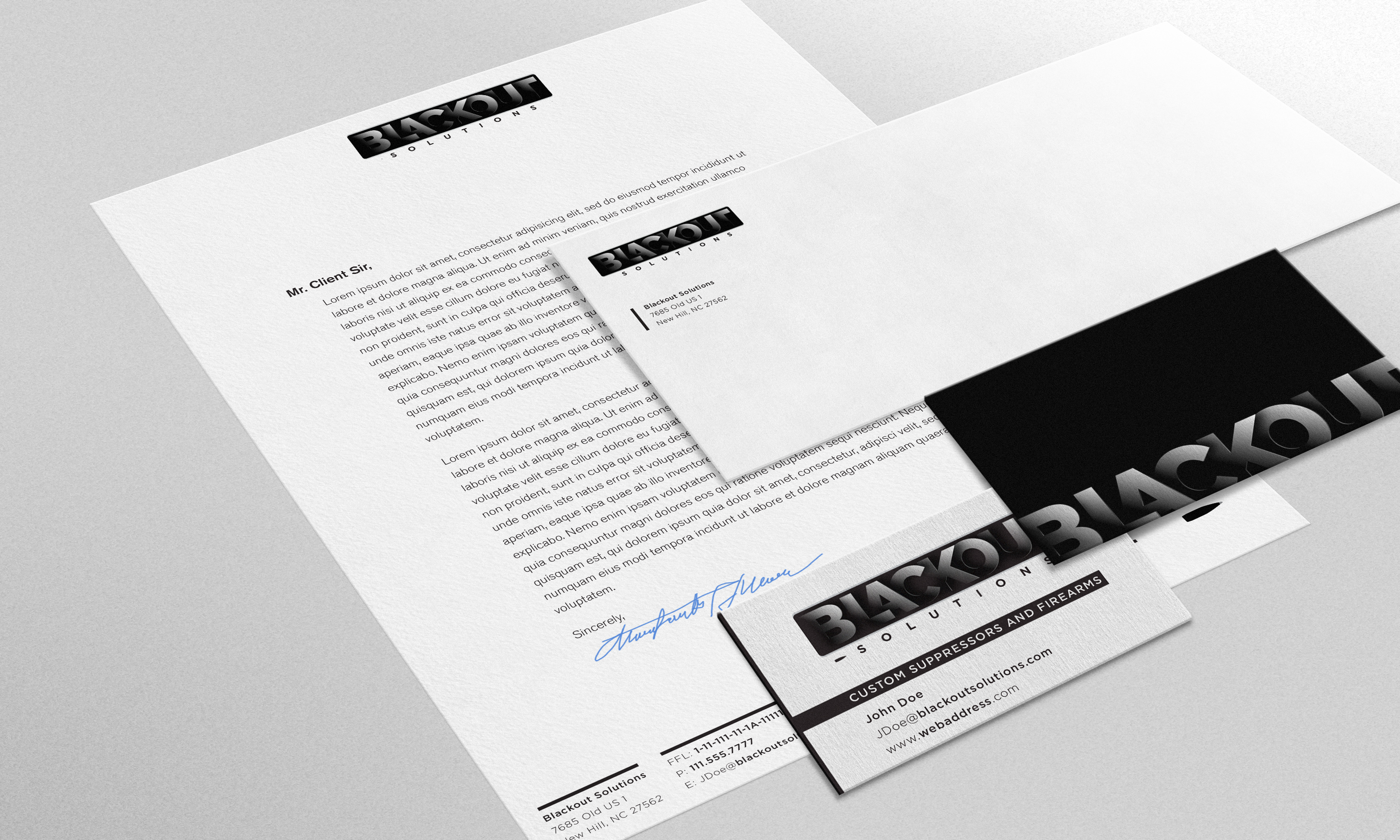
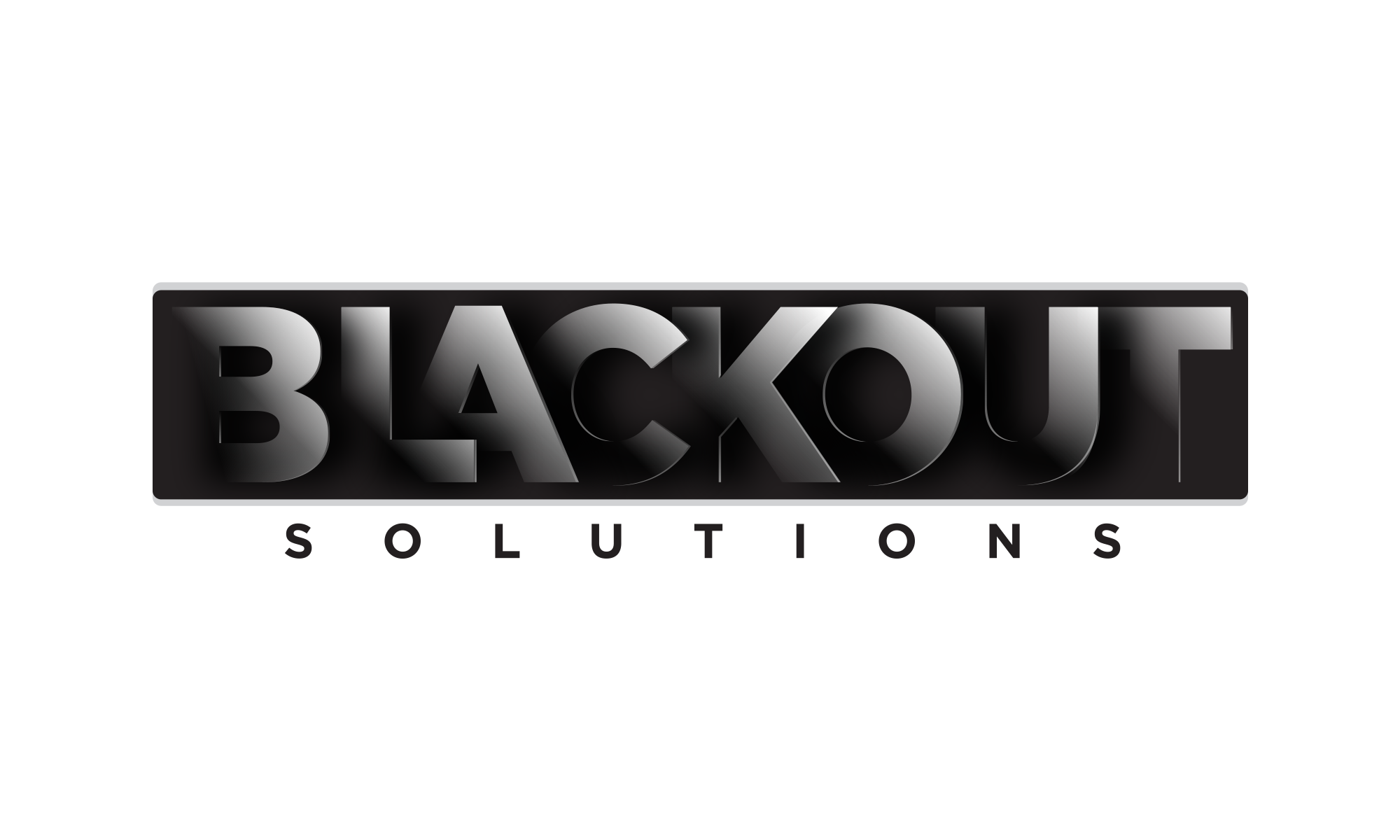
Roy has a background in big tech and built and raced cars. He is also an avid hunter with a military background. At some point, he wanted to quiet his hunting rifles enough not to wear ear protection. After all the federal, state, and local paperwork and licenses were approved, Blackout Solutions was born. The machine shop used to customize car parts would now double as an arms factory. I designed this logo for him, and even though he didn't put it into practice, I still enjoy it.
The rectangle of the mark itself represents the suppressor, while the lettering represents the baffling inside the suppressor, which, out of some black magician-ry, turns the loud roar of a hunting rifle into a "pew" within the decibel range as not to damage your hearing.
NOTE: While suppressors can be used to harm human beings, they are incredibly hard to acquire (if at all) in most states legally. The legal framework is robust. Also, Roy is my family.
